Project Overview
Dodd Camera was founded in 1891 on East 4th Street in Cleveland, Ohio. They were founded as an architecture supply store, stocking a variety of drawing and art supplies. By the early 1900's, Dodd Camera partnered with Eastman Kodak to bring his revolutionary camera to the market. This is where their focus on photography began. They operate 10 local camera stores throughout Ohio, and opened our first Chicago store in 2008. Each of these stores provide excellent customer service, friendly and knowledgeable sales staff, as well as classes and events throughout the year.
The logo redesign's purpose is to develop its brand position and update their identity.
Project DUration
Initial Sketches/ Researches: One Week
Finals/ Deliverables: One Week
APPLICATION
Process
Evaluation
When taking a look at the original logo, it has two distinct parts, the DODD and the camera, which are treated differently in two styles. DODD is all about concave lenses and convex lenses. And the “Camera” is projecting a gesture of pushing forward. The design is not integrated with the brand name. After taking a survey, I found that it took really long for most samples to realize the shape of “DODD” is a mimicking of concave and convex lens (23 out of 30). The typography feels “Asian fusion” style, and the combination overall feels outdated.
EXPLORE
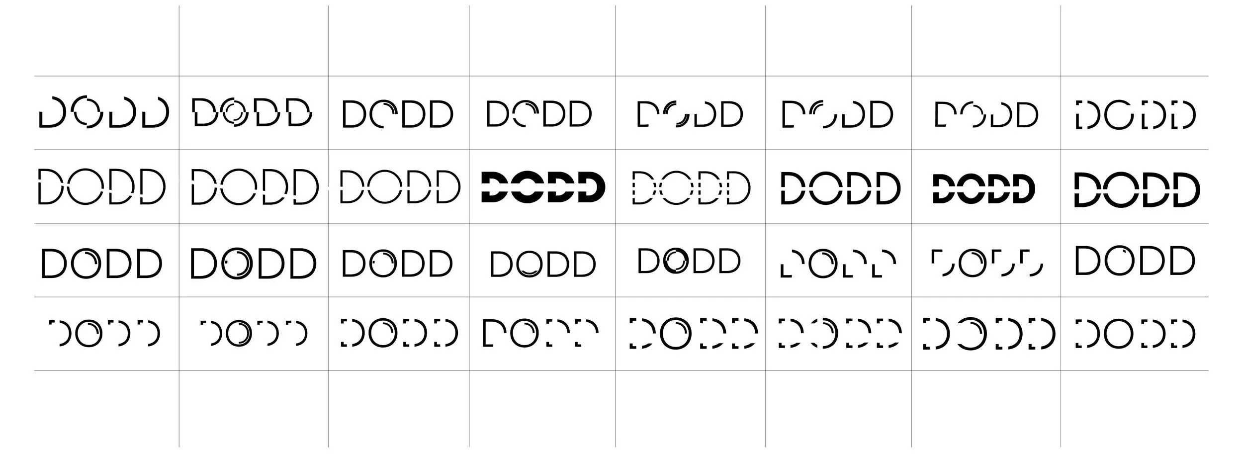
First step is to choose from the sketches and create as many variation as possible to expand the possibilities. I experimented with different type faces. There are a few directions I had in mind for typefaces: A) something that would reflect the history and culture of the brand. B) the concave convex lens feel of the original logo. C) A clean, modern square san-serif that would give the brand a futuristic feeling who carries the most advance equipment in shop.
DEVELOP
After the initial sketches, there are three directions that fits in: A) Reflection. B) The “click” moment of the shutter. C) The light beam going through the camera.
PRECISION
With the ideation almost ready, it is now about the details in the shape of the reflection, size differences, radius spacing and treatment of the word “camera”.
DELIVER
Project statement
I choose to leverage their vintage name in a sharp, contemporary way with precision. My design solution is to play off the idea of lens and human eyes. Making the small reflection at the 1/3 position of the letter "o", which I applied the general rule of photography. The color of the name focuses on the relationship of light and shadow.


